Authority Communications
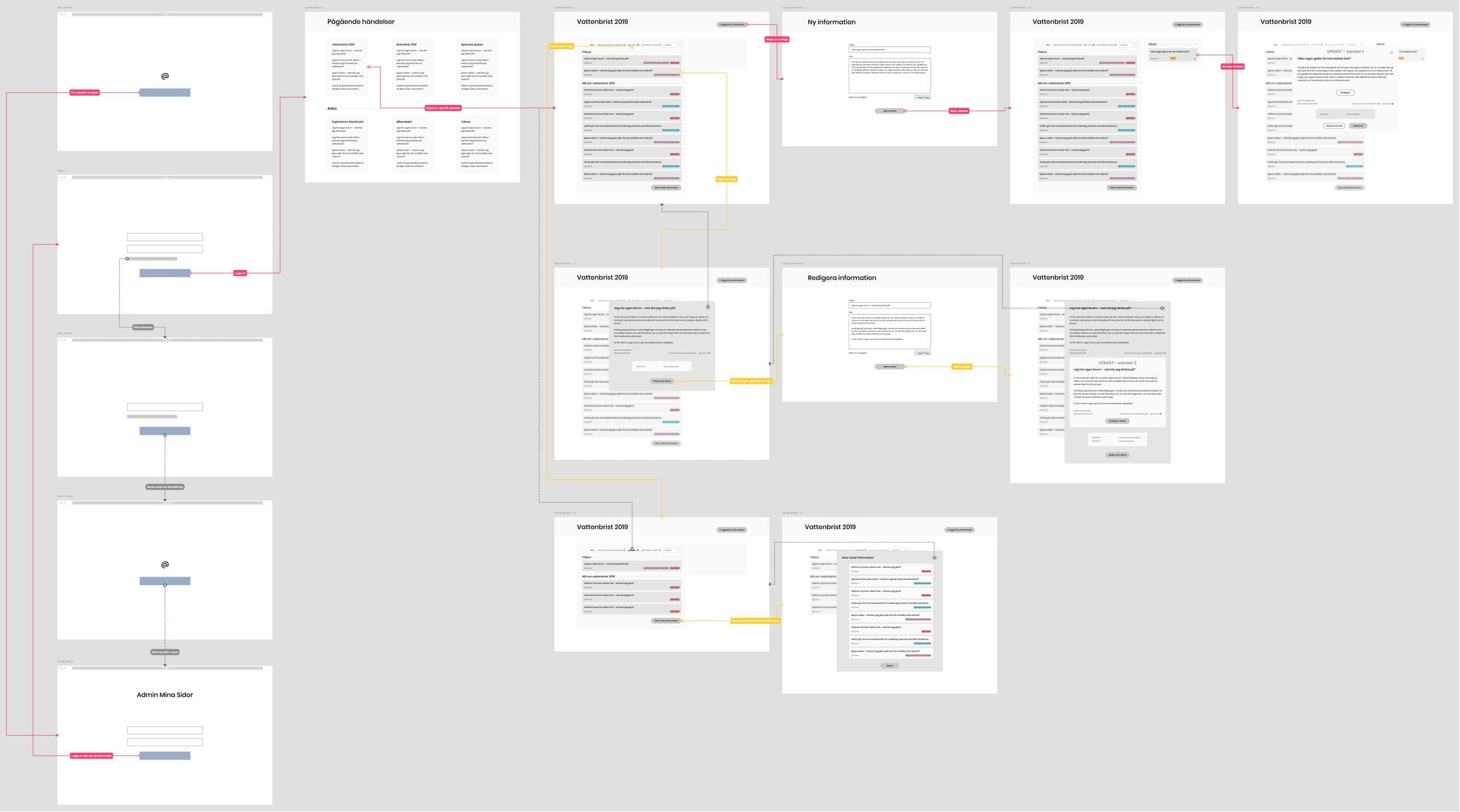
MSB has been commissioned by the government to coordinate authority communication during impactful events in society. Through user research with communication officers from multiple authorities, participation in crisis exercises and a close dialogue with the internal communication coordinators at MSB, an entirely new communications tool was created. I was involved from strategies and user journeys to high definition prototypes.
Client
MSB
Responsibilities
Strategy, UX/UI
Early response
MSB's job is to deal with crises, but as they don’t happen too often, their work is mostly preventative. When a crisis does occur, however, MSB needs to act quickly. Training and preparing for crises is hard, and it turns out many tools are not even used when people are stressed.

Taking advantage of the situation
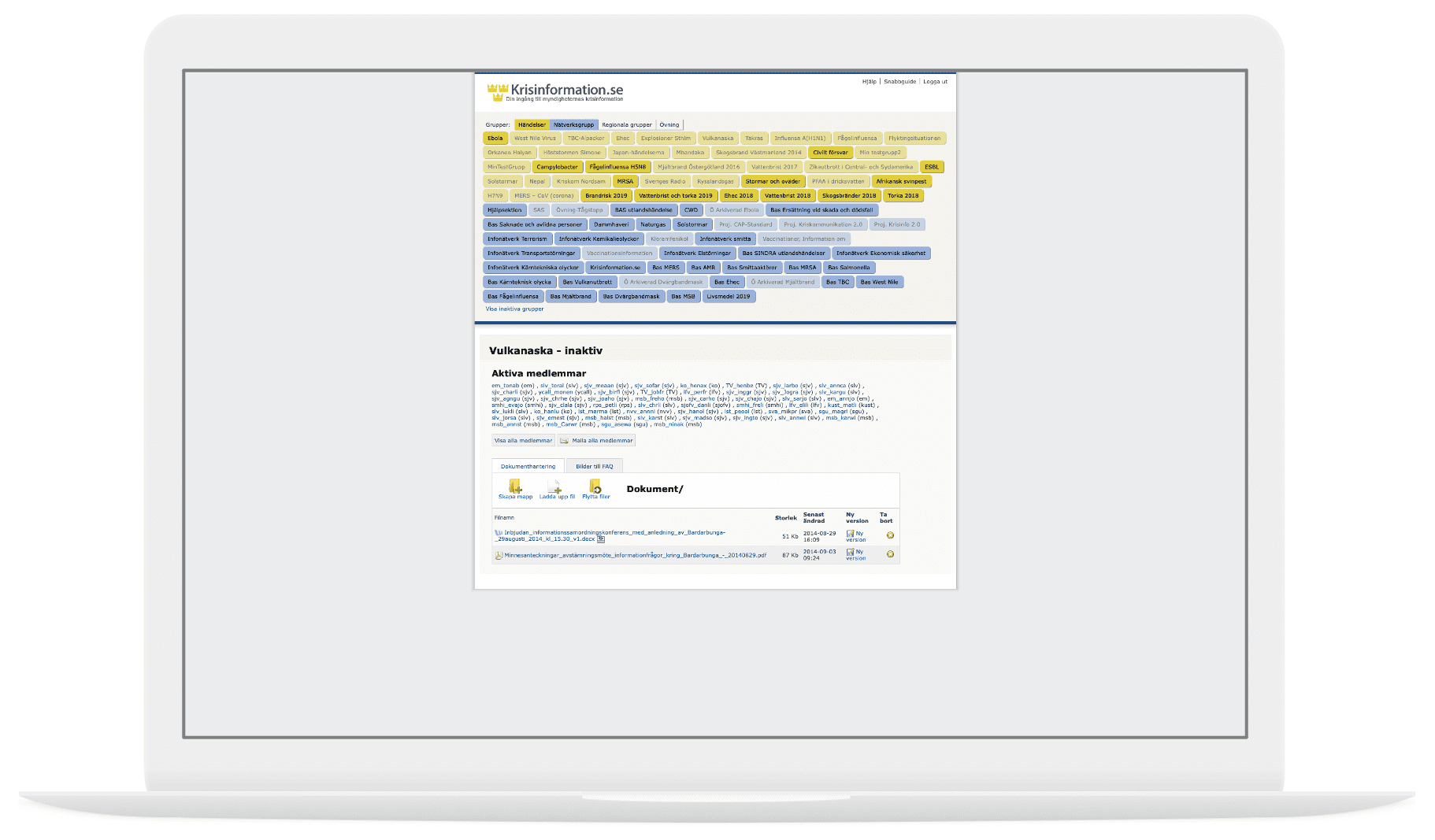
There was a tool already in use, but on a very old platform. At the start of the assignment, MSB was set on transferring their current application to a new platform with only minor updates. We wanted to see if there were more than just visual improvements needed for this tool to be accepted and used. I got involved and started doing user research.

”It just has to work, but we might not train with it”
Meeting with communication officers at different major authorities revealed that they often don’t have time to engage with tools they don't use in their daily work. They had therefore set their own routines for crisis communication; the tool from MSB was deemed too old to use and not interesting enough, often times Excel was used instead.

What can we do?
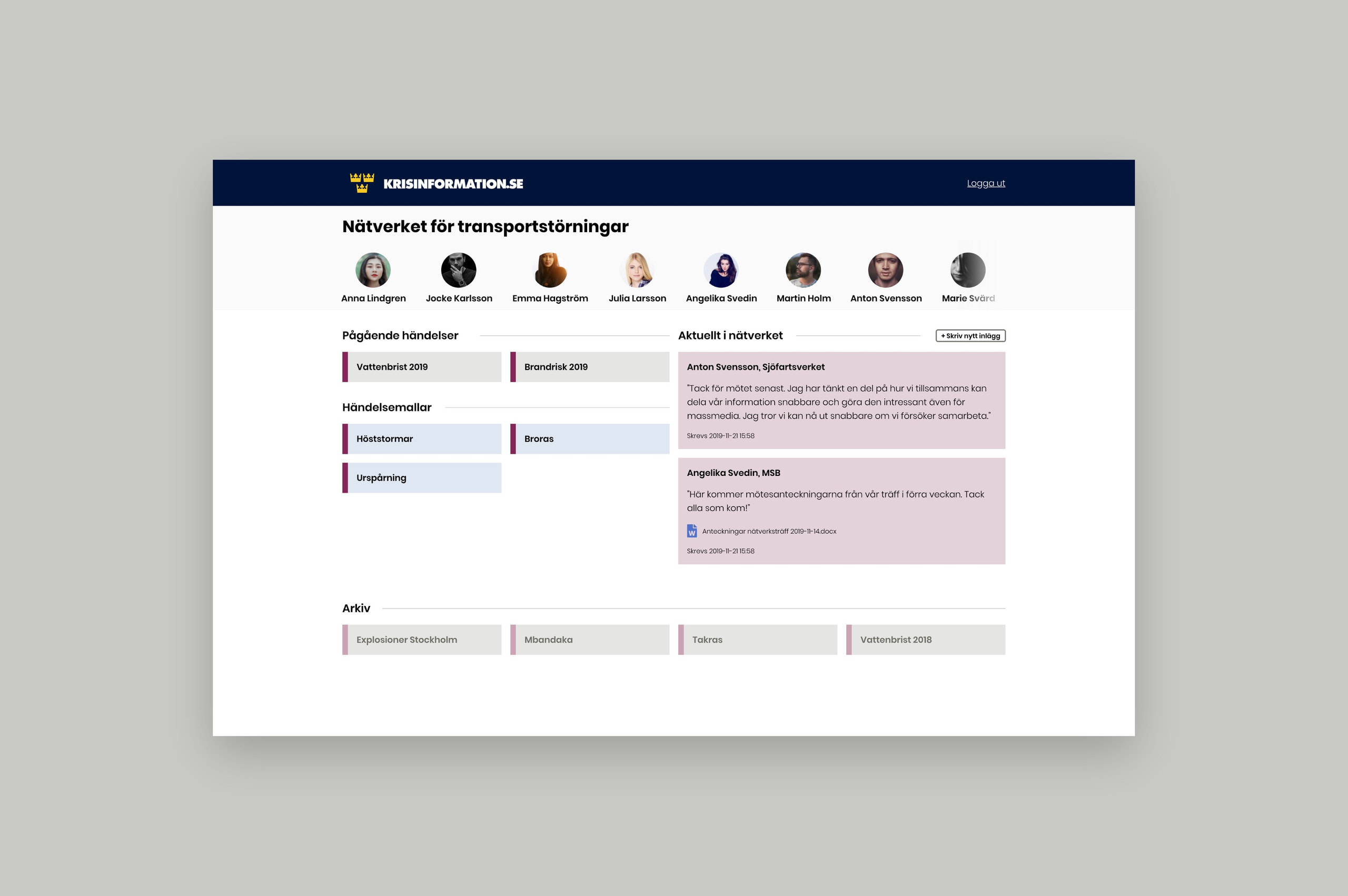
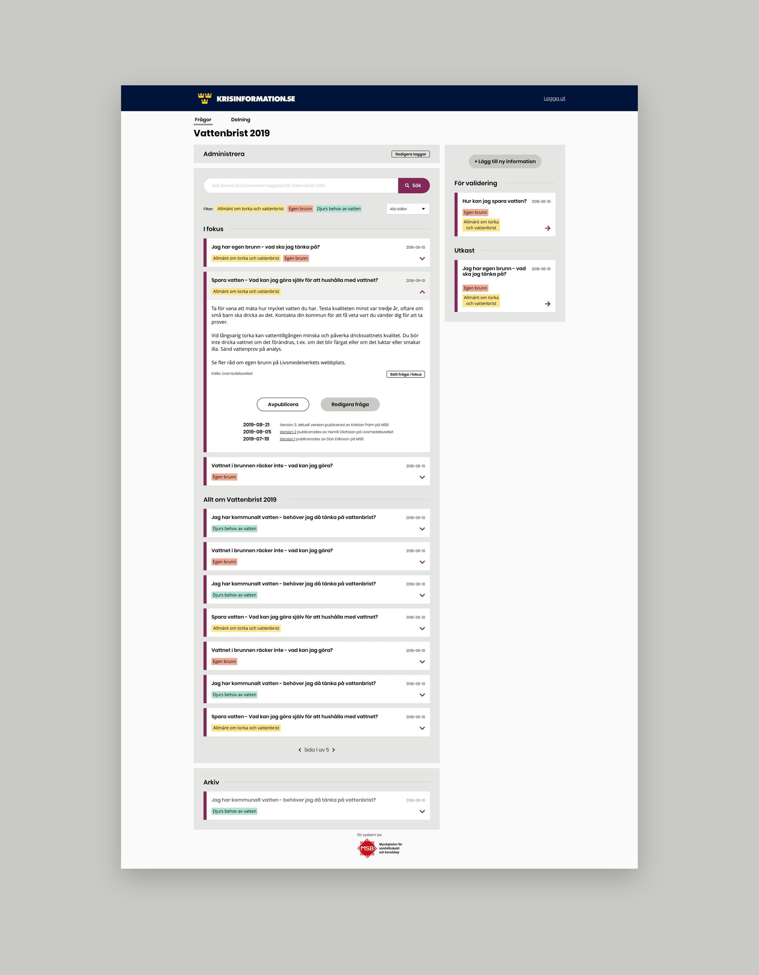
We updated the product visually, of course, but also focused on removing harder tasks out of sight for seldom users. As the majority of users in other authorities will log in with very low frequency, it needs to be easy to log in and, once inside, users need to be able to grasp the interface instantly. The major user tasks were mapped out and were refined and user tested. The final product was released just before the covid-19 pandemic.
